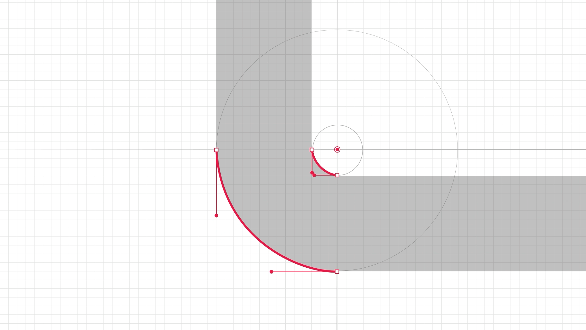
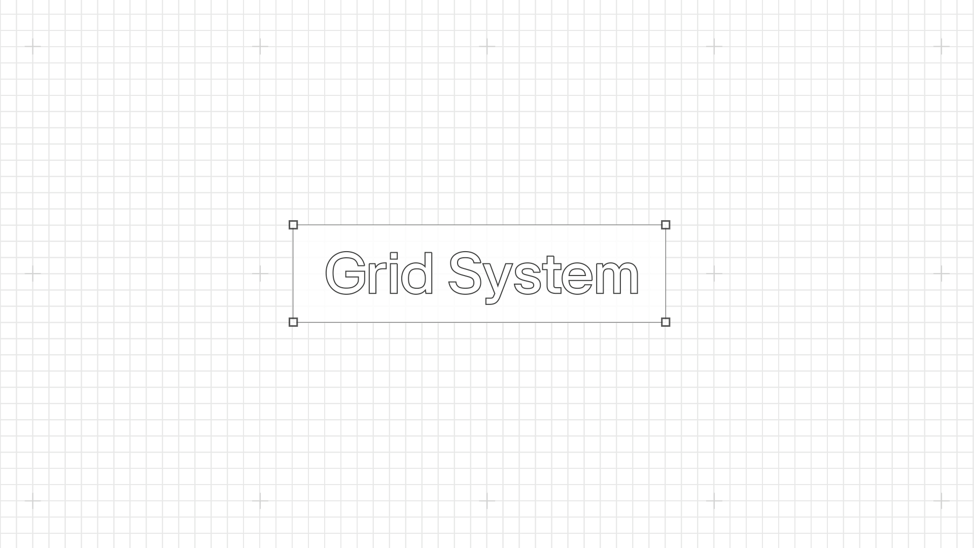
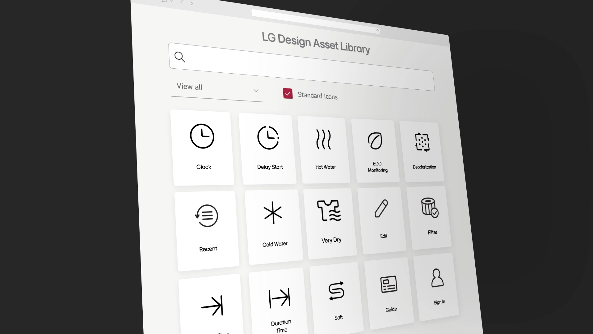
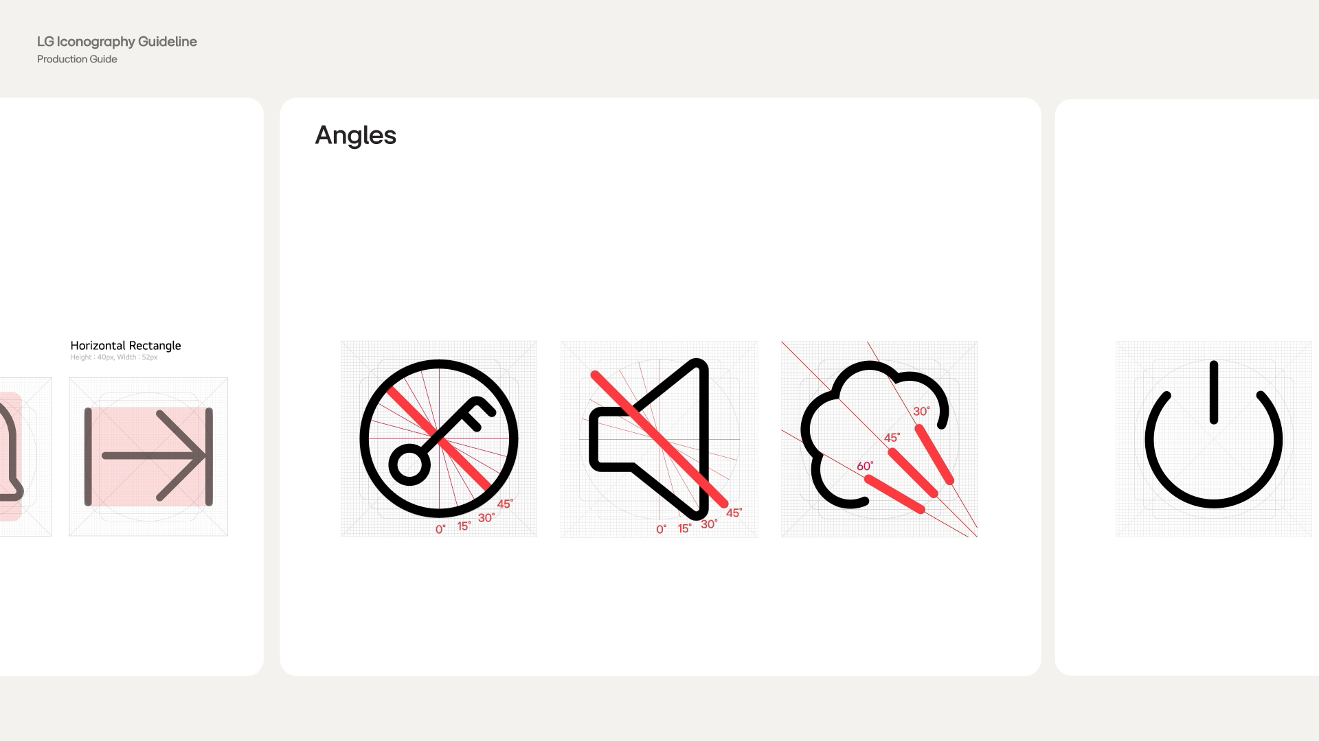
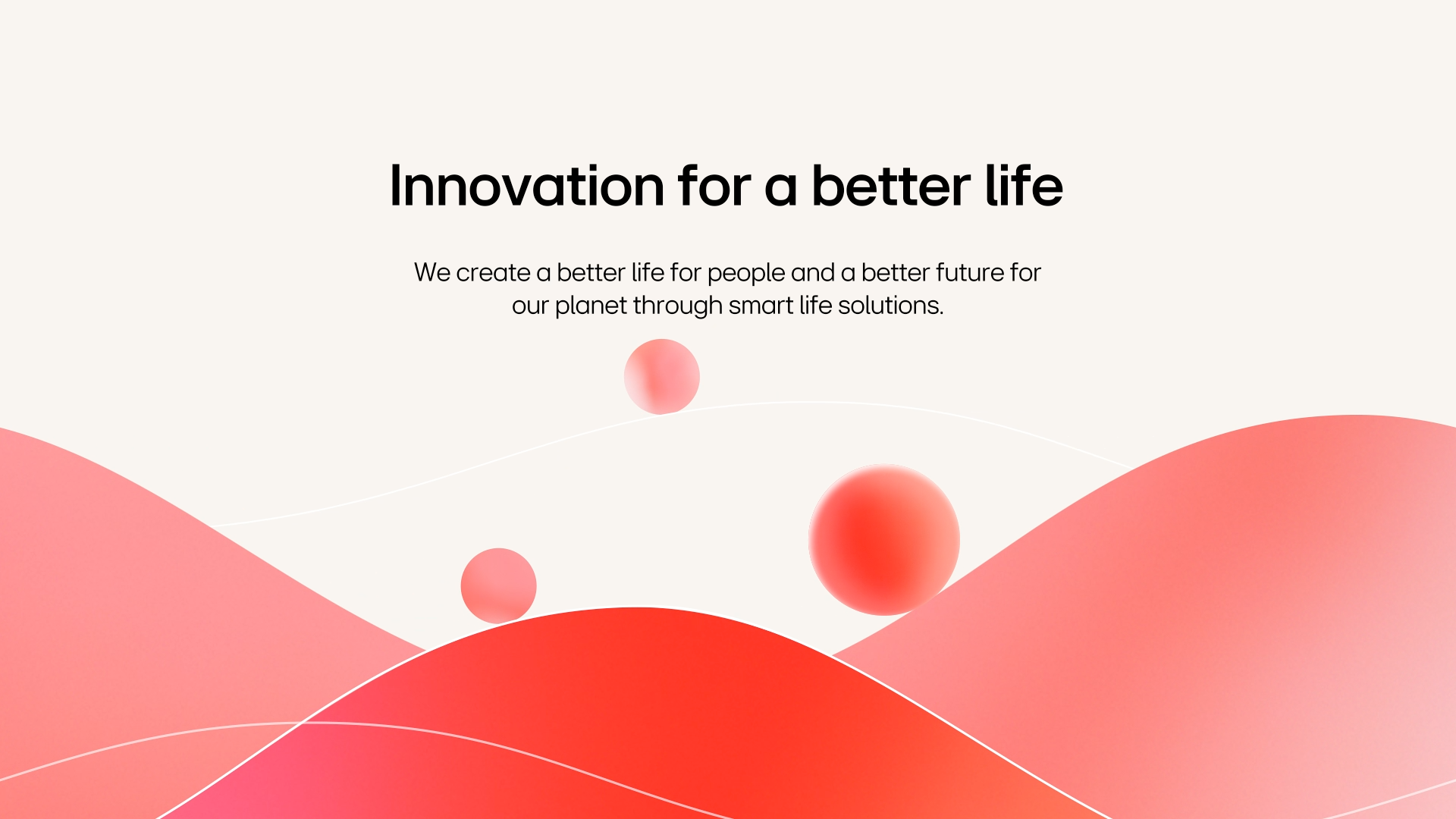
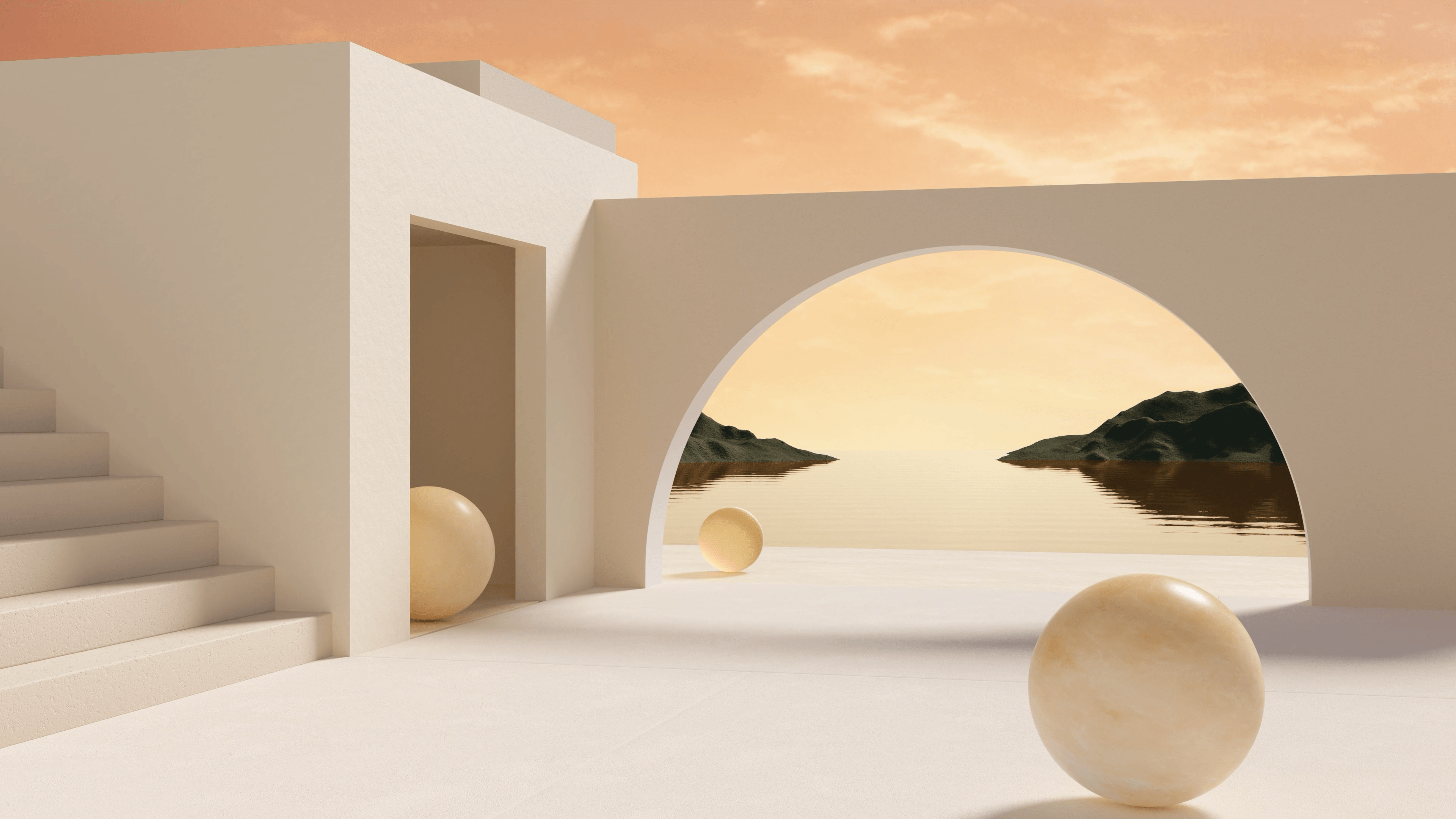
We visualized the design principles and philosophy of LG Iconography through narrative motion. With smooth curves based on rounded edges, and transitions and expansions between layers, we translated the icon system’s consistency and functionality into a seamless visual flow. By examining the structure of pictograms, grid systems, and meaning-driven forms, we restructured how these icons behave and connect within real UI environments through refined composition and rhythmic motion.
-
LG Iconography의 조형 원칙과 디자인 철학을 시각적 내러티브와 모션으로 표현했습니다. 라운드 엣지를 기반으로 한 유연한 곡선, 레이어 간의 전환과 확장을 통해 아이콘 시스템의 일관성과 기능성을 유기적인 흐름 속에 담아냈습니다. 픽토그램의 구조, 그리드 시스템, 의미 기반 형태들이 UI 환경에서 어떻게 동작하고 연결되는지를 정제된 화면 구성과 리듬감 있는 전개로 재구성했습니다.
Client : LG Electronics
Production : SpadeCompany
Creative Direction : Yoon Myoungjin
Graphic Design : Yoon Jinhwa
2D Motion : Park seoyoung
Creative Direction : Yoon Myoungjin
Graphic Design : Yoon Jinhwa
2D Motion : Park seoyoung