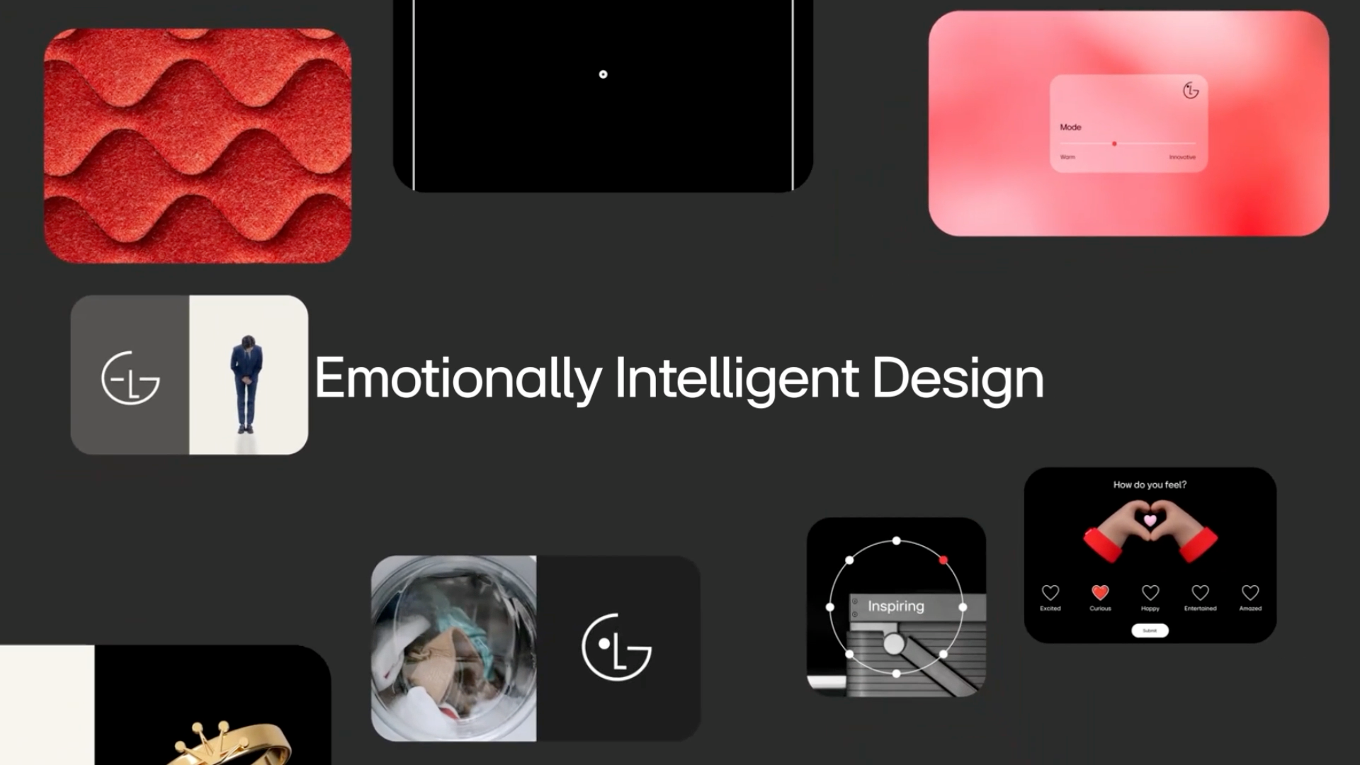
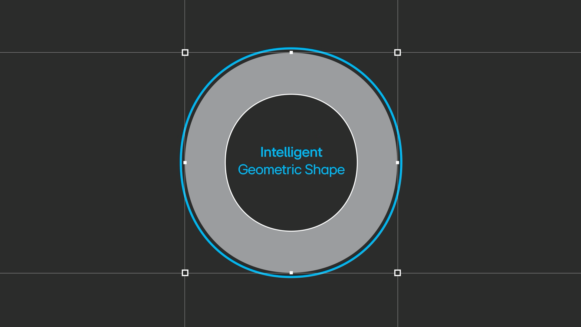
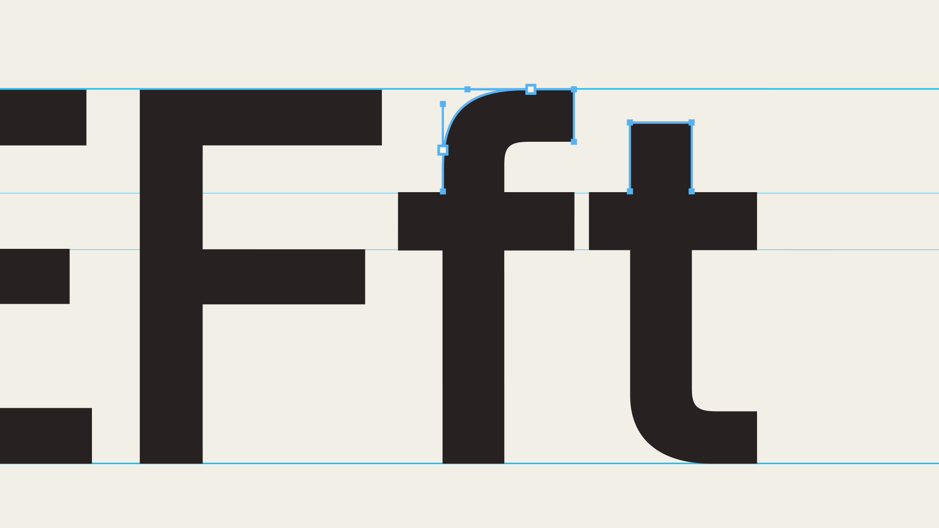
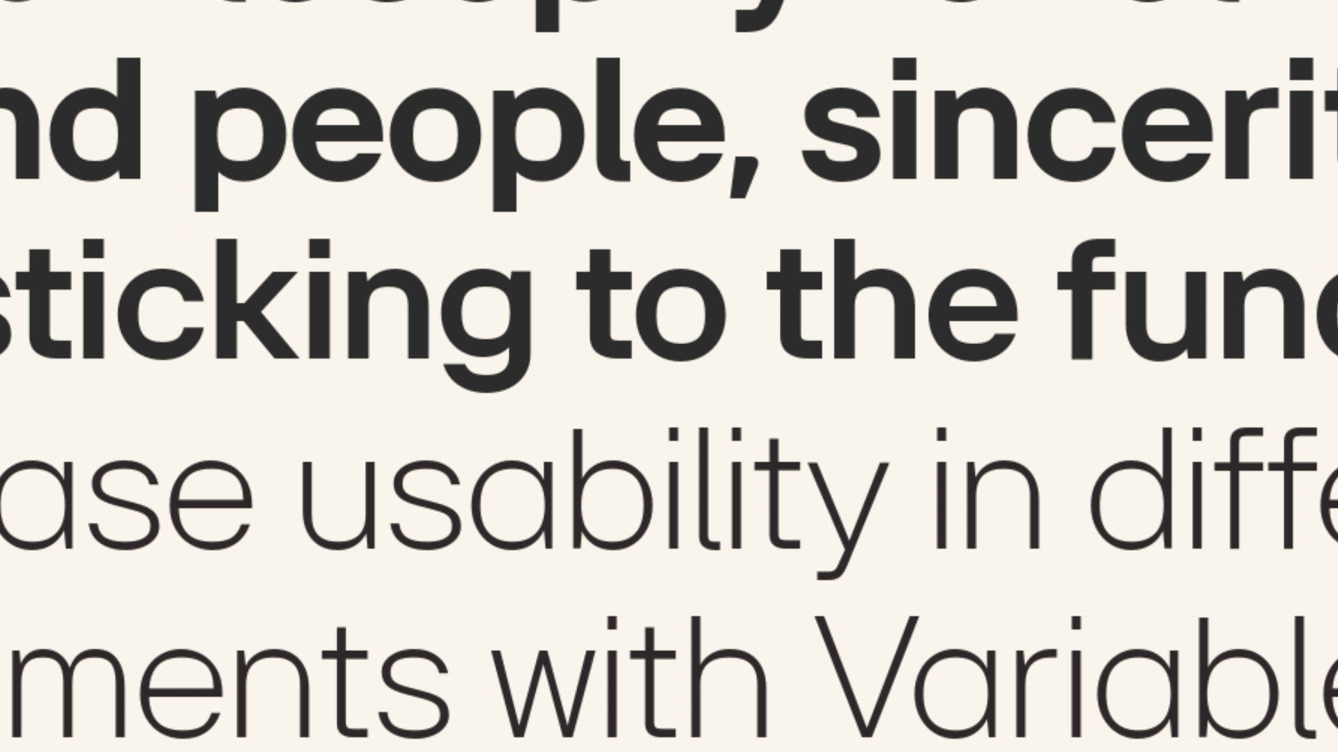
We translated the philosophy of the LG EI Headline Font into the language of motion.
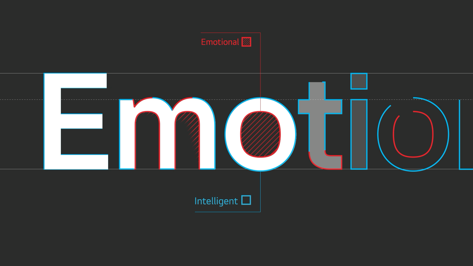
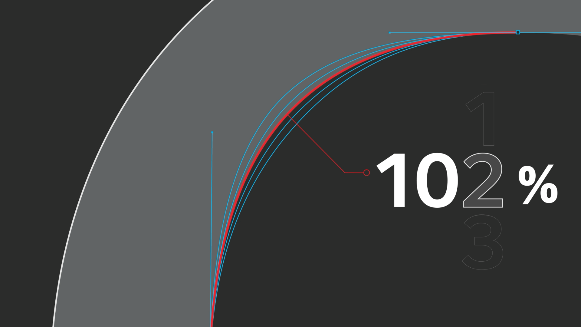
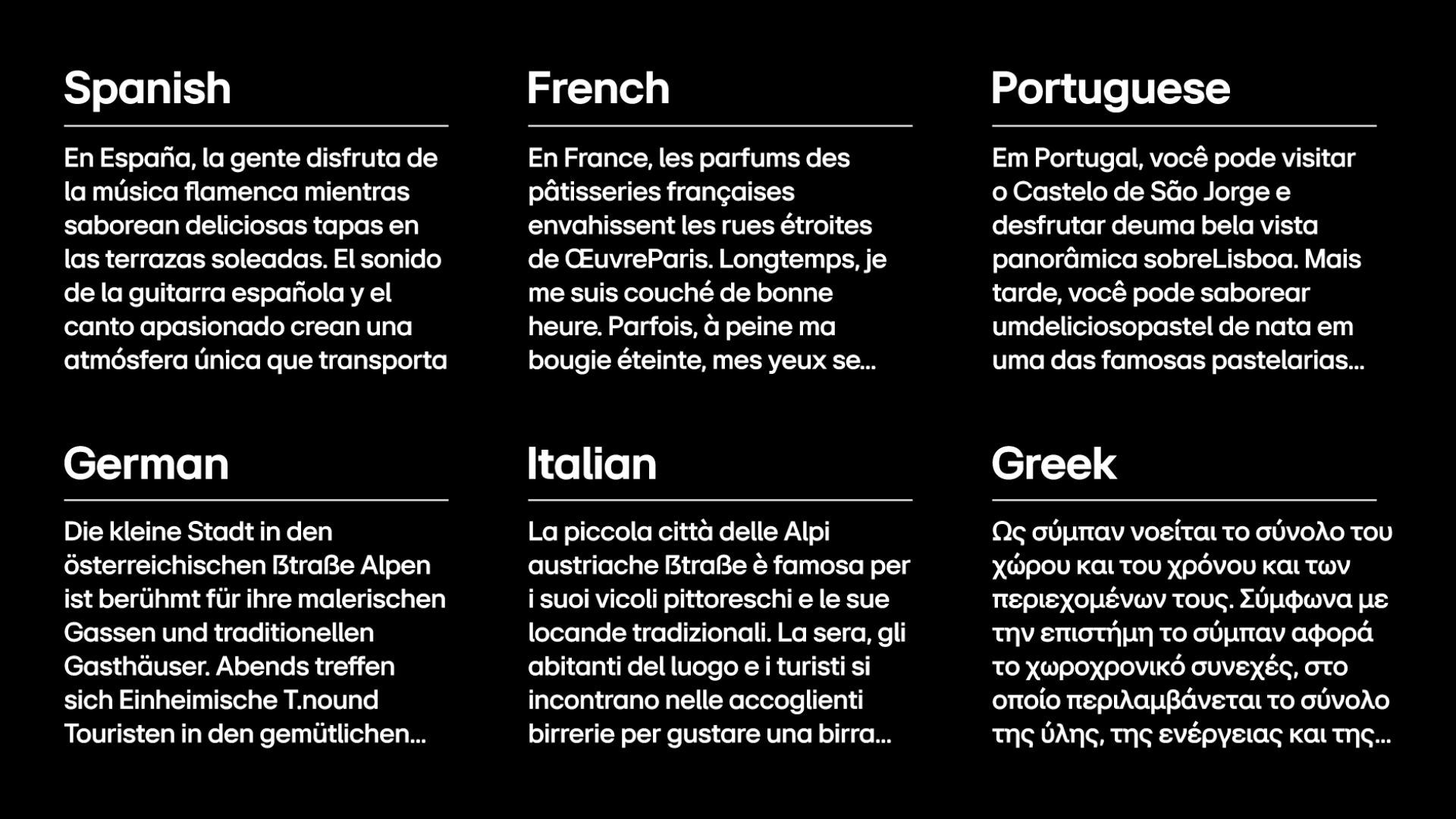
This typography-based motion graphic interprets the font’s structural details and LG’s pursuit of “emotionally intelligent design” through rhythmic composition and refined interactions. We closely analyzed the tension of curves, the logic of the grid, and the breathing space between characters—then restructured them into a visual rhythm that flows organically across scenes. Beyond a simple introduction, the video captures the brand’s emotional identity through movement.
-
LG EI Headline Font의 철학을, 영상 언어로 풀어냈습니다. 폰트의 조형적 디테일과 브랜드가 추구하는 ‘감성 지능 디자인’을
리듬감 있는 화면 구성과 정제된 인터랙션으로 해석한 타이포그래피 기반 모션 그래픽입니다. 곡선의 긴장감, 그리드의 구조, 자소 간 여백의 호흡까지 면밀히 분석하고, 이를 장면 간의 유기적 흐름과 시각적 리듬으로 재구성했습니다. 단순한 소개를 넘어, 폰트가 전하는 브랜드의 감성을 ‘움직임’으로 담고자 했습니다.
Client : LG Electronics
Production : SpadeCompany
Creative Direction : Yoon Myoungjin
Graphic Design : Yoon Jinhwa, Jeong Dawoon
2D Motion : Kim Serim
Creative Direction : Yoon Myoungjin
Graphic Design : Yoon Jinhwa, Jeong Dawoon
2D Motion : Kim Serim